We wrap gifts beautifully with our own hands. How to make packaging interesting for customers ‹ Virtual Graphic Design School Show what the product is made of
Hi all!
Continuing the topic, today I will give some simple tips, guided by which you can quickly and easily create such package design, which will not only compare favorably with competitors, but also testify to the professionalism of the designer.
Think about your last purchase. Why did you buy a product from this particular brand? Was it an impulse buy or were you originally going to buy it?
Perhaps you bought it because you found it interesting. Let's say you need shampoo. But do you need this particular brand of shampoo? This same shampoo in a shiny bottle that looks so expensive? No, you bought it because you want to feel successful and important, even if the quality of this shampoo is no different from those in the discount shopping cart!
This is the purpose of packaging. It is correct and creative packaging that helps you sell your products. It attracts attention, sends signals and directs clients' thoughts in the right direction.
I know how difficult it is to distinguish your product from the crowds of competitors, so I decided to prepare for you 50 useful tips on how to make packaging interesting for customers, and supplemented them with striking examples.
01. Use graphic templates (patterns)
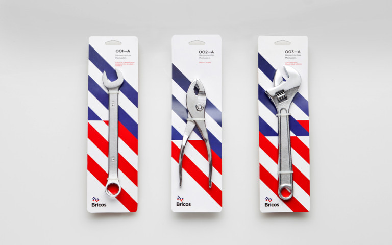
Use patterns if you need an inexpensive and high-quality packaging option. This packaging option is extremely simple, but at the same time creates interest due to the bright stripes in the background. The color palette adds quality to the packaging, truly creating the image of the “American Dream,” and the tools speak for themselves.
02. Use all available space

When making packaging, use every available inch. For example, the inside of this box has a beautiful floral print on it. Instead of leaving them plain white, the designer used a pattern that gave the box an exclusive look. It is not difficult to guess that the product that is in such a box also looks exclusive.
03. Don't be afraid of simplicity
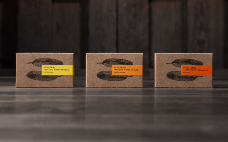
Sometimes simplicity is the key to the buyer’s soul, and this packaging is a clear proof of that. Made from recycled materials and painted in brown tones, the packaging has a simple look, and this impression is greatly enhanced by the images of feathers printed on it. Bright accents of color on the labels decorate the design and make it more modern.
04. Think about your experiences
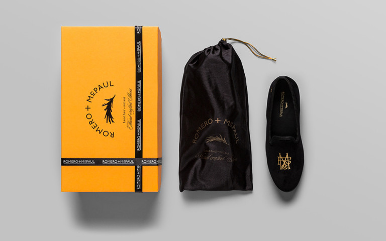
Think about what actions a customer takes when they unbox your product. In this example, the product is luxury slippers. Since they are intended for rich people, the shoes are packaged in a beautiful bag, which in turn lies in a box. The buyer opens the package, sees another package inside, and only then gets to the shoes. The simple technique of layering the packaging adds meaning to the purchase and makes it easier for the buyer to explain to himself why he chose such expensive shoes.
05. Product add-on

Make sure the packaging design complements the product inside. This packaging looks simple and natural, just like the product that lies inside. You see everything you buy even before you hand over the money at the checkout, and this creates the impression of openness and even pride of the manufacturer in its product.
06. Fool around
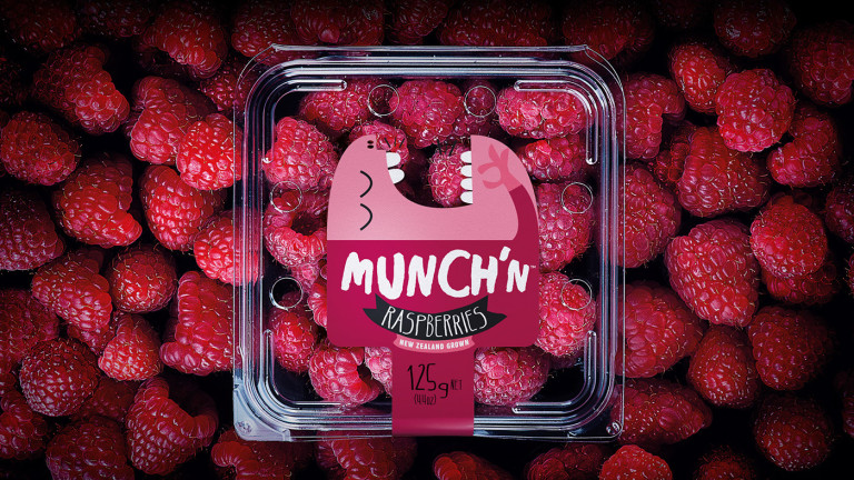
If you have the opportunity to create playful packaging, don't pass it up. This packaging looks simple and at the same time extremely funny. The design on the packaging seems to interact with the product, but does not overshadow it. The colors of the packaging match beautifully with the berries inside, and the behavior of the funny cartoon character greedily eating them hints at the quality of the product.
07. Be brave
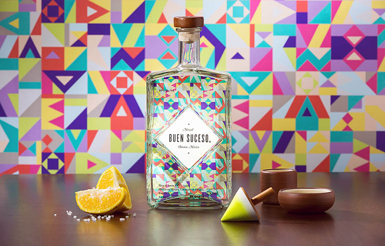
Using colorful colors and unusual shapes is a guaranteed way to stand out. When creating the design of this tequila bottle, the designer used these techniques and came out on top. The bottle looks unusual and funny and promises a fun time if you buy it.
08. Break the mold
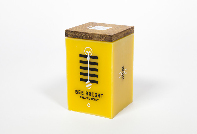
If you have a lot of competitors, try to find a way to present your product differently from everyone else, find your own unique approach. In shape, this honey packaging is completely different from a classic glass or plastic jar. Moreover, it is made of wax. When the honey runs out, turn it over and find the wick at the bottom. Yes, you guessed it right, the packaging can be used as a candle. Thus, the manufacturer has made its product absolutely safe for the environment.
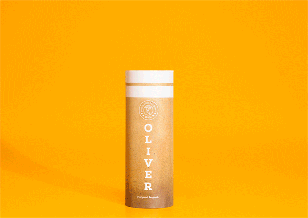
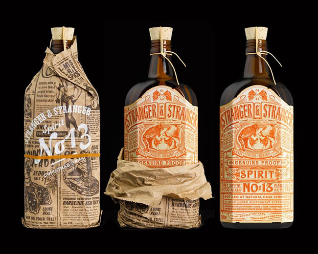
09. Think about the process
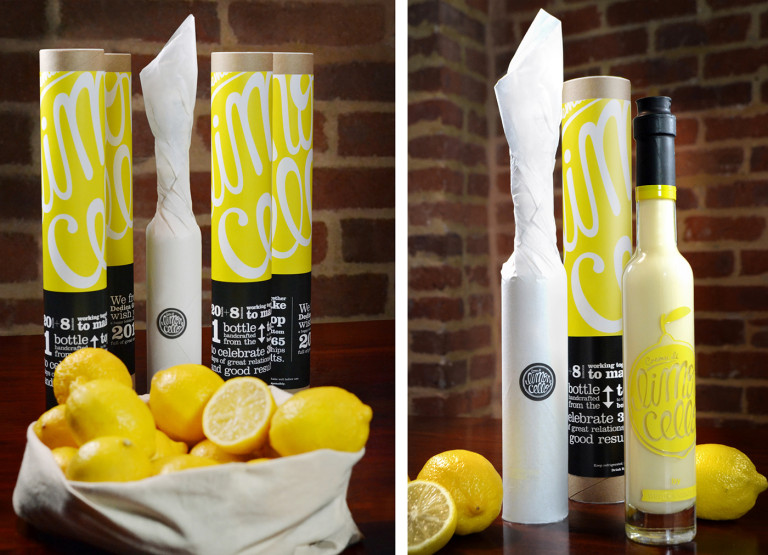
If you think your product would make a nice gift, use it to your advantage. For example, this lemon liqueur was intended as a gift and was therefore packaged accordingly. White paper protects the glass bottle inside the tall cylinder. When you open the cylinder and start tearing off the paper, you will immediately feel like you are unwrapping a gift.
10. Use styling

It is not at all necessary to make illustrations and graphic images too realistic. If you can stylize an image and apply it to the packaging as a texture, do it. This packaging features a simple image of a head and hair. The hair “entangles” the entire box, creating a unique pattern. At first glance, it is not clear what these patterns are, but if you look at the entire package, you will realize that they are flowing hair.
11. Don't limit yourself

If your product looks best in a certain type of packaging, don't limit yourself to standard ideas. For example, this soap looks best in a box, but instead of a regular box that opens on one side, the manufacturer packaged it in a box that opens like a jewelry box. An unusual box with a lid makes the soap unusual and interesting, and can then be used to store small items.
12. Be modern

Modern, simple and elegant designs always attract attention. Use clean lines, simple flowers and sans serif fonts to achieve the desired effect. This packaging looks very fashionable and modern and immediately makes you want to know who owns this product.
13. Use textures
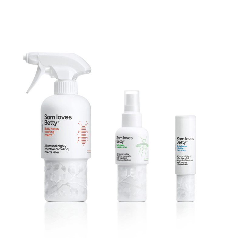
In addition to visual ones, use textures that can be felt... literally. Buyers take the packaging in their hands, which means we need to make sure that they use not only their vision, but also their sense of touch. The bottom of this insect repellent packaging features raised dots that fold into patterns. It is not only comfortable to hold, but also pleasant, and the dotted textures at the bottom go well with the pictures printed on the top of the bottle.
14. Be colorful
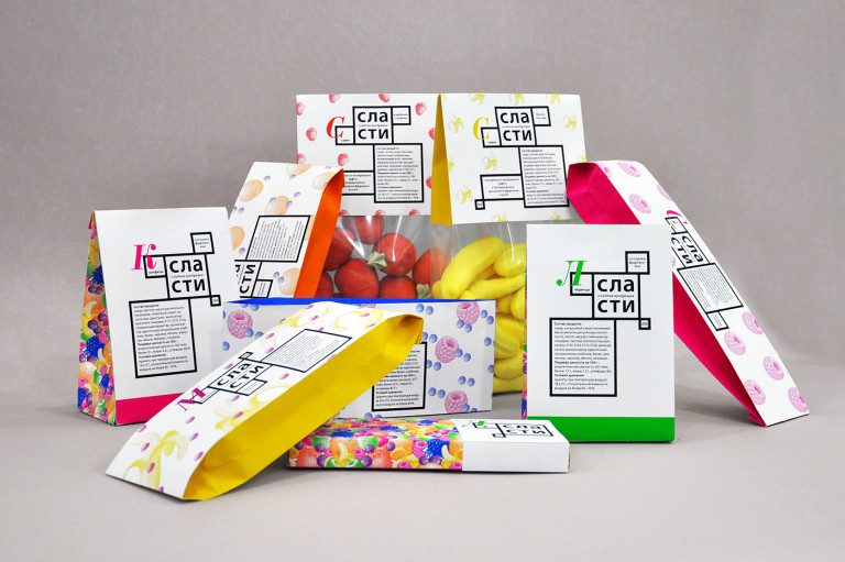
If your product is bright in color, use it to attract attention. Add bright accents to your packaging design, like the candy manufacturer did in this photo. Each bag is designed using the colors of the candy it contains. Please note that the product line looks solid, unfragmented, but you can immediately understand which package contains which candies (without looking into the packaging).
15. Tell a story
If you can tell the story behind your packaging, you'll be doing yourself a huge favor. People like stories, they like to learn something new, unknown. There is an extraordinary story behind the packaging of these socks. When you take out the socks, a tuft of cotton sticks to the lid, simulating a chimney. There were plenty of such pipes in sock factories in previous years.
16. Go back to the roots
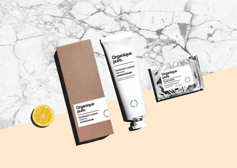
Think about what your product is and display that in your packaging. For example, this line of cosmetics uses simple, natural and pure ingredients. This is shown on the packaging. It looks simple and natural; the design uses natural brown colors, which only emphasize its naturalness.
17. Be creative
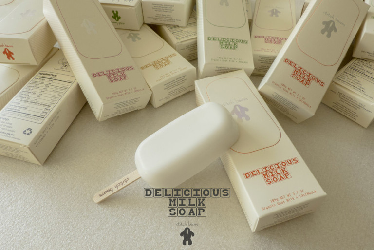
You can make the packaging attractive, but if you can make the product itself attractive, you will win twice. Take this milk soap for example. This is ordinary soap made with the addition of milk; in its place there could be any other rectangular soap. Apparently, the manufacturer also thought about this if he decided to turn his soap into an popsicle, thereby directly hinting at its milk composition.
18. Think about interior decoration
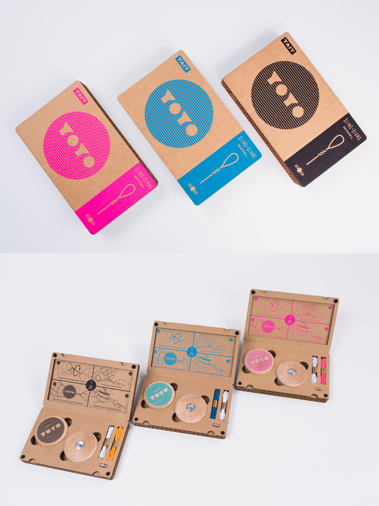
The outside of the package should be interesting, but what about the inside, which is where the product actually comes into contact? If your product consists of several parts, lay them out separately. This yo-yo packaging has a compartment for each of the toy's parts, and they are all beautifully organized. The colors of the parts match the color of the packaging; together they look organic and stylish.
19. Multifunctionality

If you produce eco-friendly products, people will definitely love your brand. One way to achieve this is to ensure the packaging is multifunctional. At first glance, there is nothing special about these cleaning product bottles, but if you touch them, you will realize that they are not made of plastic. They are... porcelain and could very well become vases when they are empty.
20. Play with feelings
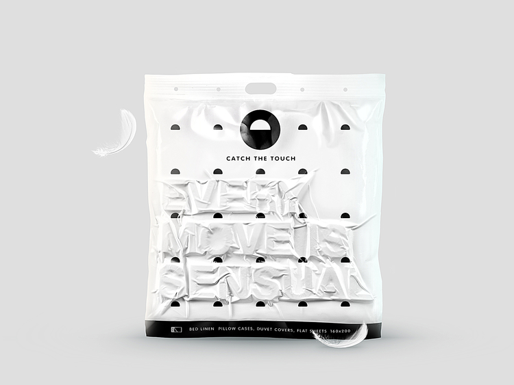
Try to touch as many of the customer's senses as possible with your packaging. With this sheet pack we see again how the sense of touch can be influenced. Before sealing, letters were placed into the packaging to create an unusual three-dimensional effect. You want to not only look at such packaging, but also touch it.
21. Give the product a voice
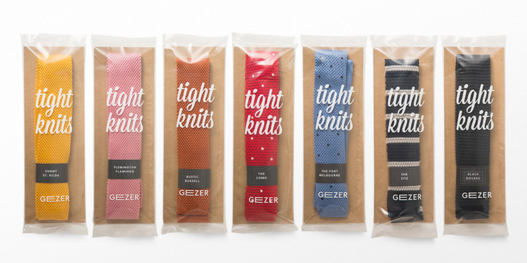
If you have quality products, let them speak for themselves. You shouldn’t wrap it in a shiny wrapper that no one needs. These high quality tights look great. Instead of hiding them in a box, leave them in plain sight so everyone can see how beautiful they are.
22. Limit resources
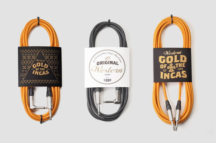
Packaging costs money, this is a simple and clear truth. If you can reduce its size to a minimum, do so. For example, these musical instrument cords are packaged simply and yet very effectively. The paper packaging features a beautiful design in gold, white and black tones that beautifully echo the colors of the cords themselves.
23. Let me take a look
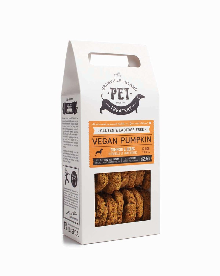
When it comes to food products, it is vital for the buyer to see what he is buying. Who knows what is hidden in boxes and bags if there is no way to look inside? The box for these dog cookies has a window so you can see exactly what you are buying for your pet. You won't be in for an unpleasant surprise when you get home and open the box, and you can already tell that these cookies look delicious.
24. Strive for luxury
If there's one thing people are willing to spend a lot of money on, it's liquor. Are you intimidated by the gigantic selection of liqueurs presented in stores, and don’t know how to stand out from the crowd of competitors? Look, no one can pass by this liqueur. It comes in a fancy box, comes with shot glasses, and comes in neon yellow and pink. It screams “Time to relax” and will be a great reminder of a well-spent weekend.
25. Limit your color palette
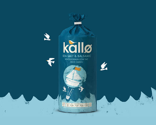
Narrow down your color palette to achieve a cohesive look. The packaging designer for these rice cakes chose a marine theme because their flavor is closely intertwined with sea salt, spices and balsamic vinegar. Different shades of blue look great together, and splashes of orange add eye-catching accents.
26. Use the product
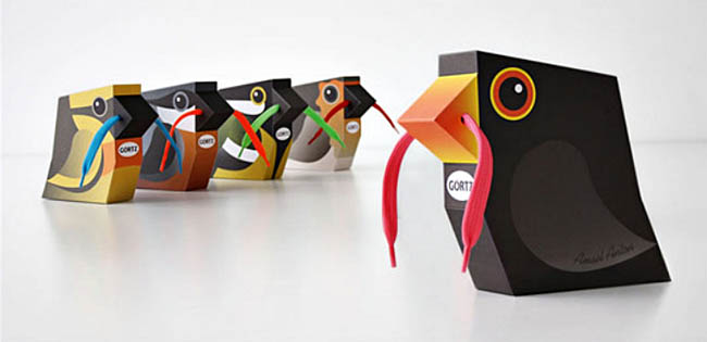
If the product can be part of the packaging, use it. For example, these shoes are packaged in wonderful bird-shaped boxes. Instead of just putting them inside the box, the designer decided to thread their laces through specially made holes, and now it seems as if the bird is holding a worm in its beak.
27. Be trendy
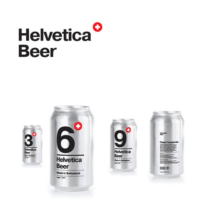
Follow current trends to make your packaging more fashionable. The design of this beer uses an extremely popular font, and the manufacturer not only built his brand on it, but also borrowed the name. Now this beer looks simple, modern and even stylish.
28. Think outside the box

Forget talking about the packaging your product “must” come in. Water is usually available in plastic bottles. However, this water is poured into cardboard boxes. Yes, it's still just water, but it looks different than its competitors, which means it's sure to grab your attention.
29. Use unusual design

Use your imagination, do what is not expected of you. The name of this vodka is slightly different from the usual ones (Spine - spine), which spurred the designer on. Since the image of the spine is applied to the glass, it appears three-dimensional, three-dimensional, and this guarantees a simply stunning effect.
30. Be literal

If your product is manufactured in a special way, try to reflect this in your packaging design. For example, these cookies are baked in the oven. So why not pack them in an oven-shaped box? This funny and unusual packaging is not at all similar to ordinary ones, and the cookies in it seem like a real homemade delicacy.
31. Get Close to Customers
Is there a common theme that affects your products? Try using it in your packaging design to connect with your customers. Not only does this bottle feature an extremely detailed label, but it also comes wrapped in wrapping paper covered in funny stories and messages. Everyone knows this unusual packaging, and everyone starts laughing when they see this liqueur.
32. Add a tactile aspect
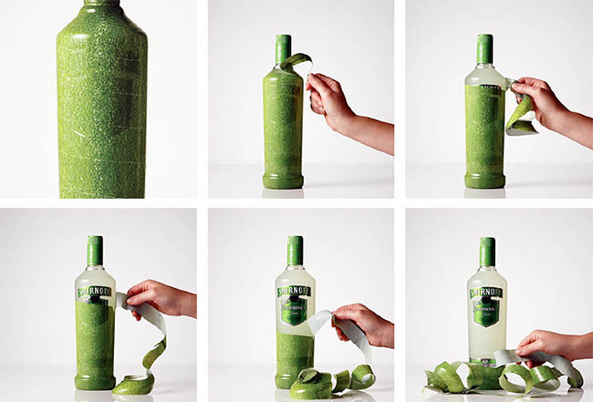
If you have interactive packaging, people will love it. Let's say the packaging of Smirnoff vodka is made in such a way that it can be removed from the bottle like the peel from a fruit. Considering the fruity aroma of this drink, this similarity looks even more natural and attractive.
33. Don't be afraid to seem weird

Arouse ambivalent feelings in people if this is your thing. These juice boxes look strange, to say the least. The resemblance to fruit is striking; there is an irresistible desire to look at them for a long time and carefully. You get the feeling that you are drinking juice straight from the fruit, and this undoubtedly plays to the benefit of the manufacturer.
34. Use humor
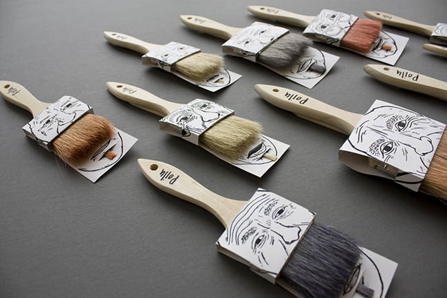
If you add a bit of mischief to your packaging design, you will benefit from it. If you make the buyer smile when looking at your product, then why not? These brushes with painted faces look extremely funny. Agree, such brushes are simply impossible not to notice.
35. Don't be afraid to exaggerate

Exaggerate and embellish shapes, colors and pictures if the opportunity arises. For example, the brand of these pillows has a bear as the main character (since the pillows are produced with the scent of honey). Instead of just drawing a cute bear, the designer decided to depict him with a wide open mouth, filled to the brim with tasty little pillows.
36. Turn your product into something else

If everyone is accustomed to seeing a given product in a certain light, this does not mean that it cannot resemble something else. Be creative and experiment with the appearance of your product. Instead of packaging tea in ordinary square bags, this manufacturer opted for “tea shirts” and even added hangers to them. Such a bag can be hung directly on the edge of the cup, which only adds functionality and aesthetics to it.
37. Show what the product is made of
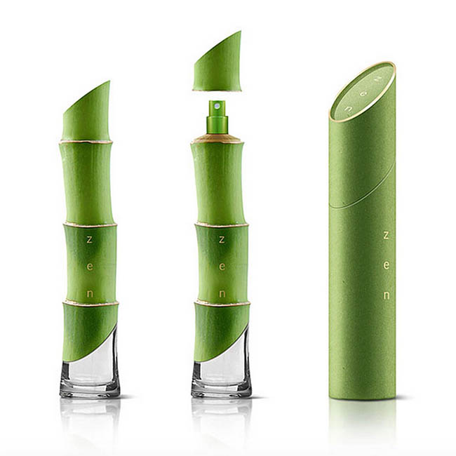
Show what your product is made of through your packaging. For example, Zen eau de toilette is made from bamboo. Instead of putting a print or image of its main ingredient on the bottle, the manufacturer decided to make the bottle in the shape of bamboo. He has created a real work of art that he wants to show to others.
38. Inner beauty
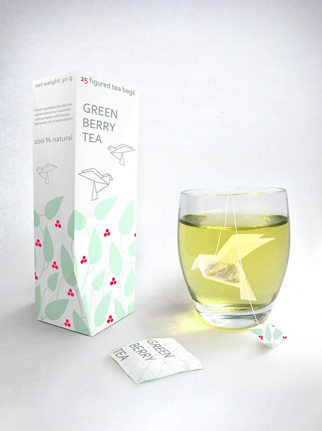
People like beautiful things. They enjoy buying and using them. Here's another interesting example of a tea bag, only this time the bag is shaped like a bird. It sways beautifully in the cup, as if floating, and creates an aura of serenity and peace.
39. Be ridiculous

Be extreme, even to the point of absurdity. These Nike Airs aren't packaged in a box, they're packaged—that's right—in a bag of air. The manufacturer decided to be literal, and this is its advantage. Your hands will naturally reach for these sneakers, which means the packaging has done its job.
40. Do something with the product

Use the product to spark your imagination, just make sure the look matches what you're selling. These headphones are used to listen to music, i.e. musical notes. The manufacturer decided not to put notes on paper, but to twist them from the headphones themselves. Agree, this design option is a good refresher for a boring piece of cardboard.
41. Take risks
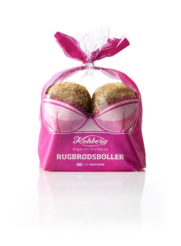
If you add a touch of spice to the packaging, you can expand your customer base. The photo shows a very ordinary bread, but the packaging turns it into something completely different. What this packaging actually does is promote breast cancer prevention, and it does a good job of it.
42. Shock!
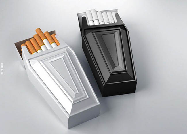
Shock your customers. This cigarette packaging is shocking. But this is the hard truth that all smokers remember when they light a cigarette. This may not be the best marketing ploy, but you will definitely get attention.
43. Push your boundaries
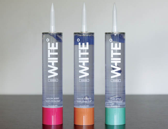
Take an unconventional approach. If customers immediately understand what is in your package, then your idea has failed. This vodka gel is packaged in a tube reminiscent of sealant packaging. Buyers are definitely in for a fun time squeezing it out.
44. Monitor the situation
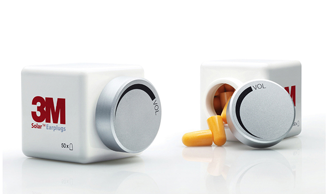
Try to understand why the buyer needs your product. For example, why does he need these earplugs? The lid of the package is like the volume knob on a stereo, when you turn it to remove it, it's like turning down the volume. In fact, it is not the lid that muffles the sounds, but the earplugs, but what an interesting idea for packaging!
45. Explain the reason
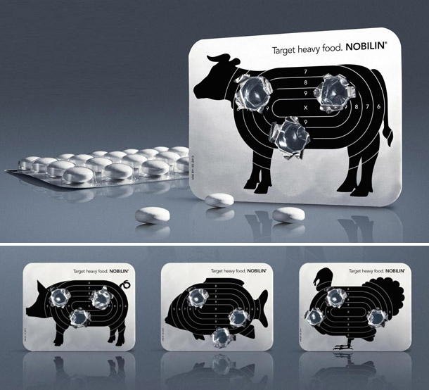
Harness the power of visual imagery. This package is for a herbal digestive aid. There is a target on the back, and when squeezing out the tablets, it feels like you are shooting at foods that cause heaviness in the stomach. The packaging bears the slogan “Targeted for junk food,” which only reinforces the impression of the effectiveness of these tablets.
46. Turn packaging into something it's not.
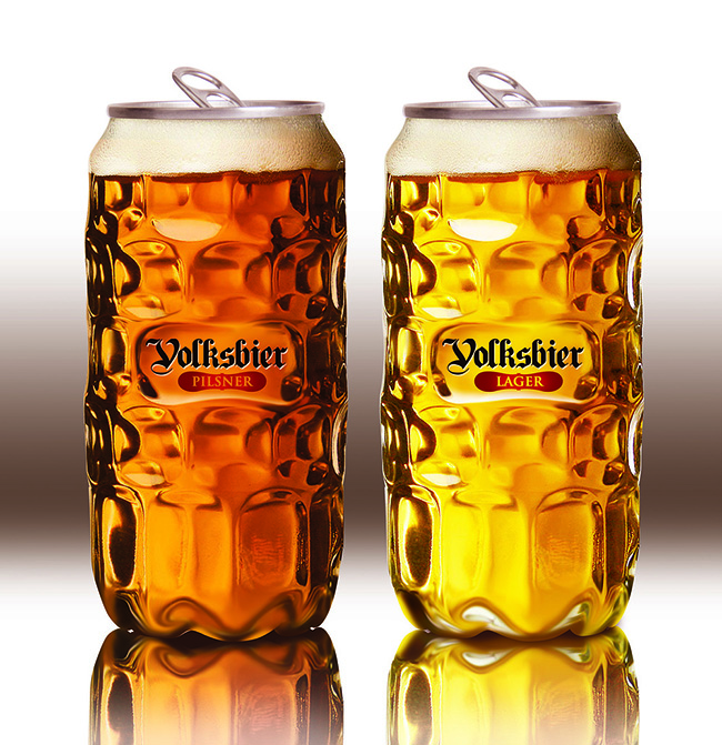
Make your product look like something else, just don't overdo it. Beer in cans usually looks cheap. This beer is also bottled in cans, but these cans look like special glasses for beer. The contrast between the lid and the rest of the can creates an interesting effect and gives the beer a unique and attractive appearance.
47. Use the product to your advantage
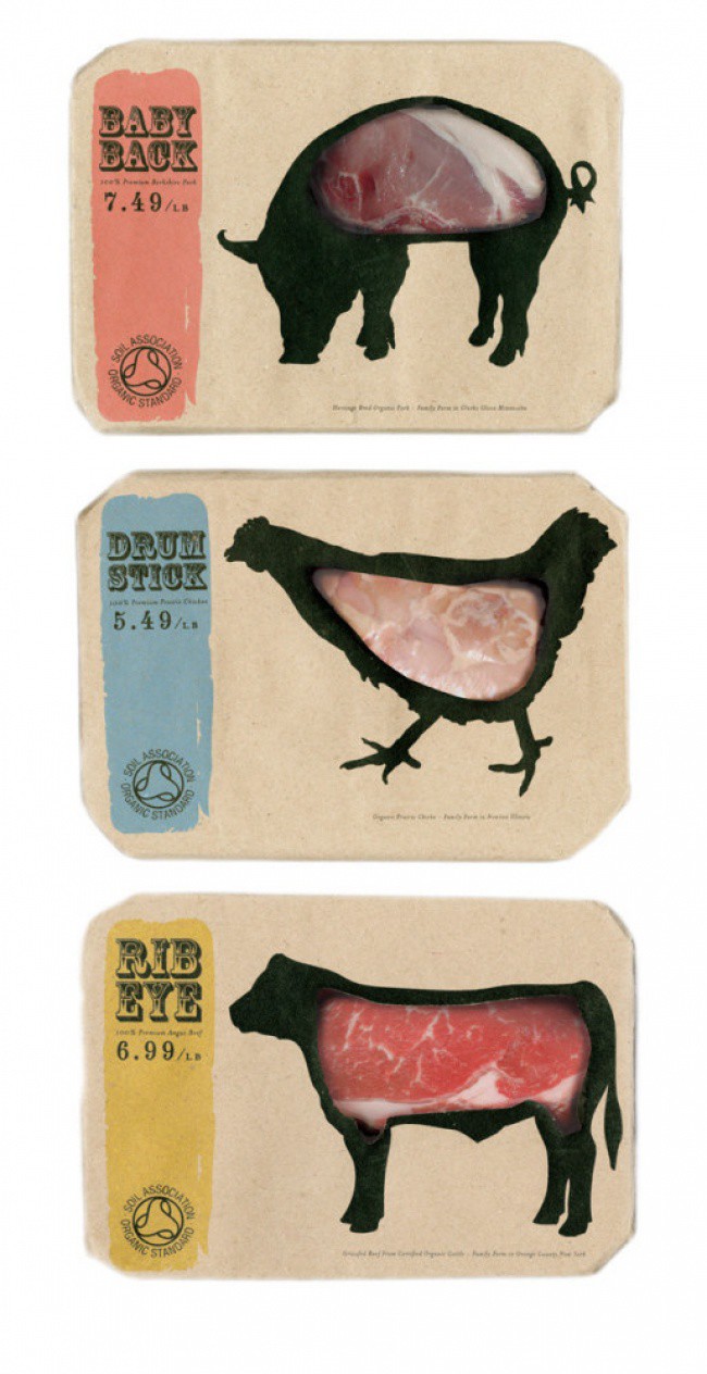
Use the texture, color and shape of the product to your advantage. For example, this meat packaging uses real meat as a design element. The image of the animal printed on the packaging clearly demonstrates to the buyer whose meat he is buying.
48. Be compact
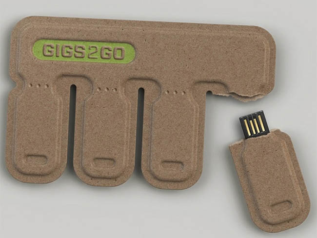
If you can reduce the packaging size, do so. The more compact your product is packaged, the easier it is to store and transport. These flash drives are connected to each other using cardboard packaging, the size of which is no larger than a credit card. This packaging is convenient to store in your wallet. If you want to give a file to someone, you simply tear off the flash drive along the notch line on the cardboard, load the information and give it away. The manufacturer took adverts with tear-off contacts as a design basis and clearly benefited from this.
49. Highlight the main thing
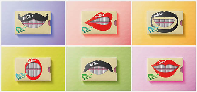
Experiment with design, because you never know what interesting idea you might come up with. The Trident company produces chewing gum, and therefore decided to make gum pads into... teeth. And to make it look really good, she complemented her lips with a funny mustache and beard. It is not surprising that its sales are growing before our eyes.
50. Abstract yourself!
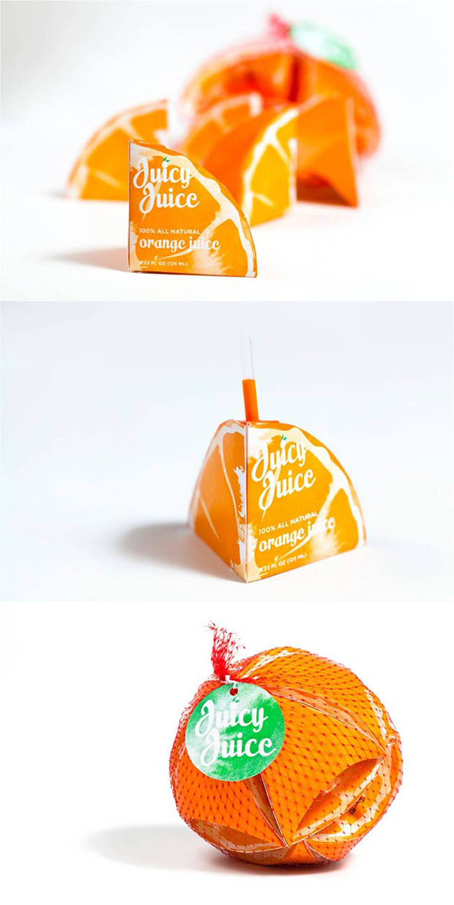
Take your product and enclose it in abstract packaging. Instead of pouring the juice into ordinary small boxes, this manufacturer made packaging in the shape of orange quarters and even applied a design to it that imitates the skin and pulp of this juicy fruit. If desired, you can collect a whole orange from these boxes.
Now that we've covered the endless possibilities for creating the most incredible, most creative packaging, you shouldn't be left in any doubt about where to go next. Your packaging can be convenient, multifunctional, funny or downright weird... All that matters is that the more creative and attractive the packaging, the higher the likelihood of high sales of the product.


The first, and therefore the most important, impression of the consumer will depend on the packaging design. The label is the link between the company and the buyer, so it must be informative and effective. It should be clearly visible on the supermarket shelf, and its appearance should correspond to the internal content.
Creative label design, convenient packaging or bright packaging material are factors that ensure the success of the product and the brand as a whole.
Packaging requirements:
Memorability and simplicity
The buyer does not have time to peer for a long time at a picture consisting of a huge number of small elements.
Original form
Compliance with this condition ensures the individuality of perception of any brand.
Information content
When creating and developing a layout, special attention should be paid to this stage, since informative packaging gives the buyer the opportunity to obtain the necessary information about the product in seconds and quickly determine the degree of its compliance with their own needs.
Emotional acceptability
An important aspect of branding. Experience shows that when choosing a product, most buyers are guided by emotions rather than a rational approach. Accordingly, color and graphic solutions are of great importance.
Legal (patent and legal).
Design verification at Rospatent (FIPS) and subsequent registration. After this, the customer becomes the sole copyright holder of the packaging. Before ordering an original design, you should remember that it is important for the designer to be able to arrange the text compactly and provide the label with a stylish, complete look. Correct presentation of information, successful selection of fonts and colors always attract buyers.
What should the packaging be like?
- Attractive.
- Informing about the product.
- Positive from the point of view of emotional perception.
What should you consider when creating a packaging design?
Cases:

"Miller" Beer brand
Task:
Competition project. Develop a beer can design and advertising layout in the “Miller” style (limited edition for nightclubs).
Solution:
The design of the can and its layout is aimed primarily at active young people who spend their free time in clubs.
The design is based on flashes of strobe lights, giving the “dance floor” the energy of tireless movement, depicting the versatility of nightclub life. The slogan is “Miller go beyond.”

"Lemonade" Natural lemonades
Task:
Develop packaging for natural lemonades.
Solution:
To demonstrate the naturalness of the product, the label is made of transparent shrink film, on which an image of a fruit on a branch is applied, as if it is immersed in lemonade. To reinforce the idea, the fruit is surrounded by bubbles. A warm color scheme was chosen for the packaging; yellow and light yellow-green colors evoke a feeling of lightness and sparkling. The emphasis in the packaging is on a photograph of the fruit framed by leaves. For the name, a font imitating handwriting was chosen, which gives the packaging emotionality.

"Ecofarm" Farm milk
Task:
Develop packaging for farm milk.
Solution:
Developing a brand of natural farm products requires special attention. The packaging should emphasize the naturalness, lightness and freshness of the product. The developed milk packaging combines traditional and modern approaches. Thanks to the image of a cow, made in the style of “ink and pen”, manual labor and naturalness are emphasized. The blue color scheme adds freshness, and the solid cow image helps to stand out and quickly count the product on the shelf.

"Lampone" Syrups
Task:
Develop creative packaging for raspberry syrups.
Solution:
The name of the product plays on the Italian word “Lampone” - raspberry, which is reflected in the series of flavors. The play on words is emphasized by the chosen form of packaging in the form of a large base light bulb with a spring spoon, and a detailed label with engravings of berries helps convey to the consumer the mood of warm home comfort and inspiration.

"Orsky Meat Processing Plant" Premium stew
Task:
Develop packaging for a premium line of stewed meats.
Solution:
The images of animals were hand-drawn and stylized in an engraving style. The shape of the coat of arms was used to emphasize the stability and reliability of the product. On the front side of the package there is information that helps the consumer make a purchasing decision: GOST, highest grade and the year the meat processing plant was founded - 1938. Black was chosen as the main color. To highlight the brand of the meat processing plant, a red ribbon is used, which refers us to heraldic images.

“Russian Catch” Fish and seafood
Task:
Develop a trademark (name, logo) and packaging for seafood.
Solution:
We started developing the project more than a year ago, before the sanctions were imposed. Two concepts were proposed: “Russian” and “Norwegian” fish and seafood. We managed to guess the future trend and settled on the “Russian” concept. During the development of the name, about 300 options were worked out. “Russian Catch” was chosen as the final option, since the company will produce seafood on the territory of the Russian Federation, in the most inaccessible and clean places of the Russian seas. The name emphasizes this feature; it plays on patriotic feelings and inspires confidence in the consumer. In addition, domestic products are tastier and healthier, because they are subject to less processing.
Advantages of Z&G. Branding:
development of non-trivial packaging;
international recognition;
the result is packaging that increases sales.
If you would like to get a quote for a new design or redesign of existing solutions, please contact the experts at Z&G. Branding. Examples of packaging are presented in the “Cases” section.
Reviews:
We thank Z&G. Branding" for developing the label and corporate character for KROKHA sausages. You met our expectations and offered a quality product.
Popok Daria, head of advertising and trade marketing department at Cherkashin and Partner
We work with all regions of the Russian Federation: Moscow, St. Petersburg, Ekaterinburg, Kazan, Chelyabinsk, Perm, Izhevsk, Orenburg, Buzuluk, Samara, Saratov, Nizhny Novgorod, Tula, Voronezh, Lipetsk, Yaroslavl, Ryazan, Penza, Tver, Vladimir, Kirov, Volgograd, Naberezhnye Chelny, Cheboksary, Ufa, Kurgan, Tyumen, Surgut, Novosibirsk, Omsk, Kemerovo, Barnaul, Krasnodar, Irkutsk, Chita, Vladivostok, Khabarovsk, Yuzhno-Sakhalinsk, Krasnoyarsk, Rostov-on-Don, Kaliningrad and other cities of Russia.
Representative office in Europe: Germany, Dusseldorf – Aachen.
P.S. Don't put off until tomorrow what you can do today! Submit your application now
It is often said that if packaging design were a sport, it would be the decathlon. A very accurate metaphor, because a professional designer must have an excellent understanding of materials, technology, branding, printing, ecology, industrial and graphic design, text advertising, layout, etc.
Similar to the decathlon, the “rules of food packaging design” can be renamed the “10 Commandments of Packaging Design”, which will help effectively market the product it contains. So, this article will talk about the 10 “commandments” of packaging. Here they are:
- simplify and you will be noticed;
- communicate and persuade, not just inform;
- stimulate appetite;
- take care of the environment;
- make sure that the packaging is easy to open and close if necessary;
- make the information block on the back of the package interesting;
- give the consumer an RTB, “reason to believe,” or USP, “unique selling proposition”;
- exaggerate a little to attract the consumer's attention;
- advertise on secondary packaging;
- be part of the whole, develop an idea or product concept.
packaging design, and with the principles of creating a real masterpiece, and with the teamwork of the client and the designer, and with the task
designer to remove all unnecessary...
1. SIMPLIFY
Three words that will help make packaging stand out in the crowded world of supermarkets filled with thousands of products: SIMPLIFY, INCREASE and REPEAT! The human brain perceives no more than three messages at a time. The designer must be able to use this fact and set priorities correctly. You cannot increase anything until you reduce and simplify what is around you. The main task is to convince the client. And this is much more difficult than composing an advertising message in which you can use psychology, give arguments and explanations, and this takes time. In addition, in order to achieve an increase in sales, it is necessary to influence any of the 5 human senses. Will it be touch (shape), sight (color), text or graphic design, or maybe sound, smell and taste? Most likely, it should be an unusual image or a very memorable shape. In the case of cardboard food packaging - and they all look more or less the same - it must be one of three things: brand, illustration, unique advantages.
But the question remains - in what order? It is known that our eyes (or rather, the brain) primarily react to color, which means that color is perceived more correctly with an optimal ratio of contrast and brightness. In the food industry, it is necessary to create an image of freshness, which is formed from the image of droplets, objects in motion and colors that evoke
appetite.
The main thing that is important for the attentive reader to pay attention to is: “If you want your message to be noticed (that is, to be read, understood and remembered), do not load it with foreign elements!" Leonardo da Vinci was absolutely right when he said: “Everything ingenious is simple.”
2. CONVINCE, NOT JUST INFORM
A variety of information is placed on the packaging. From corporate branding to recycled content. From the type of cardboard to the type of printing - offset, gravure or flexographic. From net weight to website etc. Let's first take a look at the front side. For example, information about the weight or volume of a product - 300 g or 330 ml - is boring for the consumer, and therefore he will not pay attention to it. But if you write, for example, “two large servings,” the phrase takes on more meaning and increases the likelihood of making a purchase. Therefore the weight as well as brand And logo The manufacturer, who symbolizes quality and is responsible for the degree of trust in the product, is better placed on the back, the so-called information side of the package.
- very “appetizing” illustration;
- correct price, regular or promo,
- indication of the price-quality ratio;
- tagline;
- nutritional value of the product, such as “calcium for strong bones.”
Firstly, you need to understand that the information on the packaging of a 50 g chocolate bar and on a bottle of yogurt are completely different things. Secondly, what we communicate to the consumer through packaging, print ad, website and advertising poster are also completely different things. Common sense should prevail here, which is unfortunately very rare in our time.
3. INCREASE YOUR APPETITE
In order to package was appetizing, team work needed branding agency. The goal is to choose the best ideas! However, branding agency not omnipotent and if the result does not live up to expectations, it is always not his fault:
- The lithographer didn't try;
- printing was done in a hurry;
- the buyer bought worse cardboard, etc.
- Don't be afraid of BIG images. There are FIVE REASONS for this: Firstly, packaging with a large picture visually seems larger! Secondly, thanks to the LARGE image, all minor design elements recede into the background, and therefore the focus does not dissipate. Thirdly, among the huge variety, large pictures act as a beacon, attracting attention. Fourthly, a large drawing is better remembered, and the consumer will be able to easily find it on the shelf again. Fifthly, if everything is done correctly, it is the product that will be remembered. This is important because the consumer is always primarily interested in the product; brand, name, weight, etc. secondary.
- Interesting, advantageous lighting: brightness, contrast, and backlight are important.
- Food styling: The art of making products look more attractive lies in the correct proportions, cutting the lemon so that it does not lose its color, making the photo look alive and not artificial, etc.
- Movement: Products in motion they look more appetizing than in static conditions.
- Colors: Colors can be “edible” or “non-edible”. Choose those that convey freshness, taste, juiciness, etc.
- Take an example from the masters: today, the best magazine dedicated to food is ELLE à Table (in France) and ELLE Bistro (in Germany).
- Food and people: The face will look very advantageous satisfied consumer. An excellent example of this are the advertising posters of the MAGNUM company.
- The base on which the image is applied also matters. An image printed on plastic will be more shiny than an image on paper, cardboard or tin.
- Appetizing: Many foods don't look very appealing (but taste great), so make them more appetizing by placing other treats nearby.
- Always consider natural size. Draw fruits and vegetables BIG, but don't overdo it.
- Keep it warm (or cold): All food should essentially be warm, even ice cream! But if the main message to the consumer is freshness, it is necessary to depict droplets!
- Remember that a photograph in a magazine and an image on packaging- this is not the same thing: A photo in a magazine can be saturated with various elements to create a certain mood, illustration on the packaging should be plain.
- A photograph is always more advantageous than even the most realistic drawing.
- Place a transparent window on the packaging if technically possible. Most consumers want to see the product.
- Emphasize the main advantage: If this is the texture of the product, indicate so; if it tastes like a drink, make the color a little more saturated.
- The words should be “tasty”: choose only those that convey taste.
- Exaggerate slightly! Offer a little more than what you actually have. If the theme of the picture is “GREAT TASTE”, the consumer is ready to experience exactly that!
4. CARE ABOUT THE ECOLOGY
This concerns manufacturer, packer, packer, product distributor, distributor, as well as consumer. Speaking about ecology, we mean, first of all, the ways of obtaining and using energy, and here it is impossible to derive uniform rules for everyone, since they are determined by:
- your place of residence (city or countryside);
- political situation in the country: is waste burned to produce energy (for example, in Denmark, Switzerland, Sweden, etc.) or buried, such as in the UK and a number of other countries, incl. and developing;
- level of education in the country.
And if necessary, it closed again. Remember, external attractiveness gives first purchase impulse, and the functionality is to repeat purchases! It has been said more than once that many packages are too difficult to open, especially for older people who suffer from rheumatism, or simply people who do not have very strong hands. Let’s say right away that there is a clear difference between packages that, for one reason or another, must be opened with great effort (child-proof,
from improper handling, etc.) and conventional packaging, such as cardboard packaging for drinking products.
If the package is difficult to open, it should have clear instructions on how to open it.
Here you can resort to “information design", that is, use symbols, simple words, etc. It is best to combine short text with clear illustrations, based on the comic book principle.
6. MAKE THE INFORMATION BLOCK INTERESTING
The front side of the packaging should encourage purchase - with the help of competent branding, appetizing illustrations, special offer or product benefit. The purpose of the information panel located on the back or side of the package is to lead to repeat purchase, i.e. establish a strong connection between the consumer and the brand/manufacturer. If this is so, then why are the sides of packaging often so boringly designed that the consumer doesn’t even look at them? There are five main reasons for this:
- The one who does this does not believe in the above, i.e. in that the information block stimulates repeat purchases.
- Anyone who does this does not know how to use design make information more attractive, clear, simple and interesting.
- The one who does this has no idea about priorities, i.e. about what information is more and less important for the consumer.
- The one who does this chooses design firms who know nothing about the art of communicating with consumers.
- Those who do this simply don’t bother!
- How to get maximum pleasure from the product, i.e. method of preparation and consumption.
- How to contact the company for feedback, questions, more detailed information. This could be a website on the Internet, an e-mail, a postal address or a telephone number indicated in large font.
- What is the main nutritional value of the product, described in simple language.
7. GIVE A UNIQUE ADVANTAGE
One of the main advertising functions of packaging- convince the consumer that if he does not buy this product, he will miss out on something
important. Words, illustrations, or simply aesthetics work here. design. To revive interest in the product, we updating the packaging design. There could be a lot of reasons - a new composition, competition, new packaging material, or, as often happens, a new manager has arrived! What happens next is that the brand manager or product manager contacts creative agency asking to change package design, because it has always been and will be the most enjoyable activity of any marketer.
STOP! Before you remake package design, which is always expensive and requires the involvement of third-party partners, try to think about CREATING an original “trick”! Something that will enliven the design, create a sensation, amaze consumers and motivate them to buy! This “trick” should have an original graphic solution, something more interesting than another star in the corner of the package. In fact, coming up with a “feature” is much more difficult and longer than just developing new design from scratch. After all, you have a limited field where you need to embed the key message and make it as large as possible so that it catches the eye. Someone once rightly noted that restrictions promote creativity. Pascal said: “If I had more time, I would write you a shorter letter.” So what words, shapes and colors can impress a buyer? Here are some examples:
- Become one of the true connoisseurs!
- Surprise yourself!
- Challenge your feelings!
- Finally on sale!
8. EXAGGERATE TO GET ATTENTION
If they don't notice you, they won't buy you! Everything is very simple! In order not to be missed in this life, you need to be different from others, to stand out from the crowd. You can achieve this through humor, style, appearance, etc. The same goes for packaging. Necessary stand out through design, since most products are very similar to each other. The best and easiest way is to SLIGHTLY exaggerate some element of the packaging design, be it shape, color(s), size or material. Do not forget that you need to give the consumer what he wants, but he is far from you don't always need the whole truth of life. Let the bananas be yellower and the peas greener, it’s not at all difficult.
Which package- the largest format? The one that hits retail shelves? Not at all. This is secondary (group) packaging, which can only be used for its intended purpose, or can be turned into advertising billboard. You have 6 sides of a large cardboard package (of which at least 4 are clearly visible). So what will you print on them? Product SKU? Yes, if necessary. Logo? Yes, but really illustration isn't it more interesting? Do you really need a logo if you have an amazing picture? Of course not! The cargo is not always in the warehouse; it moves around a lot. He is often “on the way.” In any case, you will have to indicate the article number, barcode and other necessary information on the box. So why not print advertisements too? After all, this will not require large expenses. This is a great way to advertise yourself without extra costs.
10. BE PART OF THE WHOLE, DEVELOP AN IDEA OR PRODUCT CONCEPT
Packaging often criticized as rubbish because consumers don't see the "big picture". Being the most effective tool advertising, and, moreover, by achieving synergy, packaging represents SAVINGS in its purest form! However, for this to happen, you need to think holistically. We cannot look at packaging in isolation, losing sight of other means of advertising, such as points of sale, website, media. There is a common belief that the most effective way to reach consumers is to follow the instructions in some design manual (which is usually several dozen pages long) on how to properly use a logo, illustration, etc. The author of this article has a completely different opinion, based on half a century of experience creating packaging, design of points of sale and developing promotional material for companies producing consumer goods.
My opinion is based on 5 main points:
- the market situation is constantly changing;
- We are constantly learning new techniques to help us connect with consumers;
- thanks to developing technologies, we constantly have new materials, tools, etc.;
- what we thought was a good decision can lead to failure;
- all manuals and instructions are correct in general, but wrong in detail. It is difficult to find two identical markets.
And finally, the eleventh commandment. It sounds like this: "just do it"! Thank you so much to Nike for this wonderful call!
Lars Wallentin is from Sweden and was educated at the Graphic Arts Institute in Stockholm. In 1964 he began working for Nestlé, Switzerland, where for almost 40 years he was responsible for the development of creative design leading brands. For many young people working in the field of marketing, he became a real guru, teaching design, public relations and the art of creation packaging worldwide. He is currently engaged in writing books on design and packaging creation, lectures, acts as a jury member at several prestigious design competitions, and also consults for companies producing consumer goods. The basic principles that formed the basis of his ideas can be expressed in three words: simplicity, surprise and synergy.
Hello!
One of the ways to increase sales of an online store is to use original packaging for the product. The original design of the box, label and other elements (for example, adhesive tape) play an important role in increasing brand recognition and identification. Yes, creating your own packaging is an additional cost. But they will pay off handsomely.
Let's tell you why.
Researchers have found that when a customer evaluates a product itself (especially during the first purchase), 70% of the impression depends on what kind of packaging it has.
Just one example. Nike launched the sale of Nike Air sneakers not in traditional boxes, but in a plastic bag inflated with air.
Nike Air sneakers packaging
This packaging killed three birds with one stone:
- The company literally showed the product face to face: the unusual packaging attracts attention.
- She emphasized the name Air, which is not just a beautiful word, but a designation of the special quality of sneakers - their “airiness”.
- Made delivery easier, since the sneakers have completely transportable packaging.
Your main task is to surprise the buyer and make him remember your brand for a long time.
Shorr Packaging Corp. found that for more than half of shoppers, custom packaging adds value to the product. The first impression of the product (and the seller) is formed in 100 milliseconds. It is the packaging that gives the buyer the first tactile experience with your brand.
Another important point. Premium shoppers who spend significant amounts on online purchases are 15% more likely to make a repeat purchase precisely because of attractive packaging and the ability to use it for photos on social networks. Remember how, during the release of the iPhone X, empty smartphone boxes were actively sold online. This is a good example when packaging worked for the image.
Thus, the creation of original packaging can be considered not as another expense item, but as a marketing investment.
How to create optimal packaging?
1. Determine what might appeal to your target audience
You can develop an expensive super construction box, but it will turn out to be unnecessary for your customers. Your customers may be interested in the environmental friendliness of the packaging, the ability to use it in everyday life, including for children’s games, and its strength, which guarantees that the goods will arrive safe and sound (this applies to fragile goods). Or, on the contrary, ease: the ability to quickly open and dispose of the box.
The main thing is that the packaging evokes only positive emotions.
Those who decide to engage in packaging should have a special attitude towards packaging. Develop a corporate identity so that your boxes are recognized: then they will work for your image.
The packaging design can and should be changed: in accordance with the time of year, holidays, client status (for example, for regular customers you can introduce “golden” gift boxes and so on). This is a huge scope for imagination. The main thing is to choose the right direction.
Publication from Funnysocks.ru(@funnysocks_ru) Dec 14, 2017 at 7:27 PST
2. Calculate your budget
Calculate how much the original packaging will cost your product. You might want to consider a related option: selling holiday packaging or construction boxes separately.
You can also package the product in a “special way” as an incentive: for new customers, for those who purchase products for a certain amount, and so on. But in this case, your packaging must have some value. The simplest option is to be functional so that the buyer can use it after receiving the goods.

A box that can be used as a jewelry box, from designer Gaba Guzik
Original packaging can serve as the basis for many promotions. Announce a competition for the most original photo of your box. Or invite customers to show how they use your packaging in their daily lives. Such competitions can easily become viral and quickly spread across social networks. And this is a great way to promote your brand.
Study how other online stores package products. But don’t repeat it, do it better! If it turns out that in your niche no one makes original packaging and makes do with standard bags and boxes, you have a chance to win the eternal race for the buyer thanks to the facts stated above.
In any case, don't chase a super original design. The packaging had to be logical. Bright or, on the contrary, pastel colors, fonts, pictures, shapes, original printing stamps, posted information: all this must be combined with the product, harmonize with it.

4. Consider how packaging can highlight the value of the product
You can place your slogan, holiday wishes, various appeals, and useful information related to the product on the packaging. And even just a funny picture to improve your mood. In any case, the main goal is for your client to see the value of your product and forever associate this feeling with your brand.

5. Highlight the feature of the product
As in the case of Nike Air, you can try to focus buyers' attention on the features of your product. If the product is somehow related to the environment, use green colors. If you are selling something original, bright, you can play with contrast: choose a white or black box and play with it in an advertising campaign (discover the brightness).
5. Predominance of packaging style over content
Creation of packaging design. Don't be tempted to follow current trends. They are like waves in an endlessly changing sea of design. If you rely only on them, then sooner or later, you will look back and realize that your design is no longer relevant. Only interesting ideas live forever.
6. Not just a pretty cover
When you think about it, structurally or graphically, it's very easy to forget that it's more than just a box on a shelf; this is a 3D object.
Sometimes, when the brief for creating a packaging design has certain restrictions regarding packaging facing, you can creatively play on other aspects. For example, at one time it was very popular to use original barcodes, memorable copywriting and creative icons. These are the chips that are often
are overlooked, although with them the concept comes to life literally before our eyes.
7. Create packaging design out of context
We don't always remember that our projects end up in the real world. They live in a fiercely competitive environment where it is not easy to win the love of consumers. And in the store they are by no means on a white background. They are held in their hands and brought home. Successful product packaging design must cover the entire path from purchase to packaging disposal. Keep in mind what will happen to the product in the outside world. Only by taking all this into account can you create something truly worthwhile.
8. Packaging design for an award
Designing packaging to stroke the designer's ego is always wrong. We all love to show off a little, but if you rely only on this, pushing it to the brief, you will never achieve an excellent result. Try not to set yourself the goal of absolutely winning the competition. Think about the client and consumer, try to create the most innovative solution for this category, and the rewards will follow.
9. What battle should you lose to win the war?
Our business is very subjective, and clients are rarely visually savvy and sometimes have little imagination, but they are just people. That’s why sometimes you feel that the design process of creating a packaging design develops into a constant struggle for results. Remember, the secret to victory is knowing what to fight for. Trying to save precious kerning or piss off a client who insists on pink will never lead to a conceptual victory. Sometimes you need to lose a few soldiers in order to win the war. Your willingness to compromise shows your flexibility and open-mindedness and helps build trust with your clients. It's always difficult, but try to step away from your work and focus on what really matters. And maybe then you'll understand how to achieve great results, even if the kerning makes you wince.
10. Take work to heart
This may upset some, but what we do is far from an exact science. Design evaluation is very, very subjective. Our task is to satisfy the needs of the business, client and consumer, and not our own ambitions. Although, again, we love to show off. But we are lucky, we do what we love and get paid for it. It is also worth coming to terms with the fact that the result of our work will be subject to redesign in the long term, and in the short term it will go straight to the trash bin. If you don't have the sense of humor to take criticism objectively, then you are doomed to either burn out or be tormented by doubts.


